Data visualization is one of the most effective tools we as scientist have available to communicate the complex relationships we usually encounter in our research.
The need for effective and clear science communication has never been more apparent than in the current COVID19 era, where researchers are relied upon more than ever to inform policy makers.
In this blog post I want to take a look back at the beginnings of data visualization in the domain of public health and elaborate on two of the most famous pioneers.
John Snow
In 1854 the London district Soho suffered from a Cholera epidemic with more than 500 residents losing their lives between August and September 1854. At the time, the Miasma theory was generally accepted amongst scientist, postulating that the cause of cholera, chlamydia, black death and other epidemics is “bad air”. This predecessor of the nowadays accepted Germ theory of disease, prevented any kind of meaningful interventions fighting epidemics at the time.
Enter John Snow!
The English physician John Snow (1813-1858), who was already familiar with Cholera due to the 1848/9 epidemic, suspected contrary to popular belief the cause for the ongoing cholera epidemic to be contaminated drinking water.
To test his hypothesis he plotted the number of deaths per building (black blocks) and the location of street pumps (black circles) on the London street grid in the most affected area of Soho.

This disease map, in combination with supporting evidence, convinced Snow that the source of the 1854 Cholera epidemic was a contamination of the Broad Street water pump (highlighted in yellow).
Unfortunately, his conclusions were not easily accepted by his contemporaries. Unconvinced but worn down by Snow’s insistence, the council eventually agreed to removing the handle of the Broad Street water pump and in turn stopped the spread of the infection. [1][2]
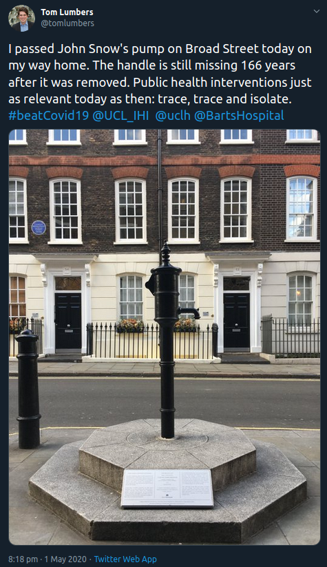
A replica of the Broad street water pump, complete with missing handle, can be visited in Soho commemorating John Snow’s pioneering research and contribution to public health. Tom paid it a visit just recently:
Florence Nightingale
In addition to her groundbreaking work in the field of nursing, Florence Nightingale (1820-1910) is another pioneer in the field of data visualization. She is also celebrating her 200th birthday today! Hooray!

After the start of the Crimean War in 1853, the first war covered with day-to-day correspondence, the British public was appalled to receive reports of the high death toll among British soldiers.
In 1854, 34-year old Nightingale accepted the position as Superintendent of the Female Nurses in the Hospitals in the East and travelled to the war zone. There she observed the poor hygienic and living conditions of soldiers in the war camps and hospitals, caused in large part by the incompetent military administration.
Nightingale began to advocate and implement interventions to increase sanitary standards such as hand washing. Furthermore, she started to take meticulous account of soldiers’ death and causes of death.
This data formed the basis of one of her most famous graphics: “Diagram of the Causes of Mortality”

This polar chart records the causes of death per month for the years 1854 and 1855. This plot, comparable to a polar histogram, could clearly illustrate that the overwhelming majority of soliders indeed died due to “preventable or mitigatable zymotic diseases” (blue areas) and not due to wounds (black area) or any other cause (red area).
Nightingale was convinced drastic changes in the military administration were needed to prevent the unnecessary death of thousand of soldiers in the future due to the incompetence of the elite class of Army officers and doctors. She further recognised the power of carefully designed graphical data representations, able to catch the attention of even the most uninformed spectator and superior to relatively boring data tables.
Nightingale sent her diagrams and publications to political decision makers - Parliament members and even Queen Victoria - but also doctors, and the Commanding Officers as well as the Commander-in-Chief. In 1859, she became the first female member of the Royal Statistical Society.
[3]
Plotting the COVID19 Pandemic
Building on the groundbreaking work of these pioneers, the importance and utility of data visualization only increased in modern times. No news report these days on COVID19 infection rate is complete without a graphic plotting infection or casualty numbers over time. Exploring these time courses between different countries can for example inform about the effectiveness of interventions.
Albert Henry used the freely available John Hopkins CSSE Covid-19 dataset and the R Shiny framework to create the interactive online tool Covid-O-Meter. Below an exemplary animation created with the app.

The Covid-O-Meter (or covidometer) is an open access, daily-updated interactive web app designed to track and visualise various statistics related to the Covid-19 pandemic.
Go and give it a try!
The Covid-o-meter provides a simple interface for users to navigate through different parts of the dataset directly and to make their own discoveries.
Data Visualization Tutorial
If this blog post motivated you now to go and create some beautiful plots of your data, I would highly recommend to check out this ggplot2 tutorial of the Code Club. The Code Club is an initiative lead by PhD students from the Institute of Health Informatics, UCL, to encourage and support better coding practice and skills and is headed by Albert Henry and Rini Veeravalli.
And while you give the Code Club website a visit, why not fill out the membership form to be from now on always up to date on the amazing talks and tutorials they are offering.
References
[1] Excellent blog post on John Snow’s water pump and my favourite London history website
[2] Brown University lecture on an historical introduction to data science
[3] Article celebrating Florence Nightingale’s achievements in the eponymous journal of the Data Visualization Society